Redrawing the World: The UN Voted to Retire the Map That Shrank Africa. Why?
For four and a half centuries, the world’s default map made Europe and North America look larger than they are and the global south smaller. This month, the United Nations voted, overwhelmingly, to change that. The lone dissenter was the United States.
Almost everyone alive has learned the shape of the world from a lie. Not a malicious one, and not even an intentional one, but a distortion so familiar that most people never think to question it. On the map that hangs in classrooms, fills textbooks and loads by default on screens around the world, Greenland appears roughly the size of Africa. In reality, Africa is about fourteen times larger. That the world’s standard image of itself could be so wrong, for so long, is the quiet scandal the United Nations has now voted to correct.
On Friday, the UN General Assembly backed a resolution, spearheaded by several African countries, urging member states to adopt a map that represents the continents at their true relative sizes. The vote was not close. One hundred and sixty-four countries supported it. Six abstained. Only one, the United States, voted against. The resolution endorses the Equal Earth projection as, in its words, “a relevant option for improving the accuracy of the cartographic representation of the world,” and while it is not binding and bans nothing, it carries the moral weight of near-unanimous international agreement that the way humanity has pictured its own planet needs fixing.
To understand what is being corrected, one has to understand what is being replaced. The traditional world map is the Mercator projection, created by the Flemish cartographer Gerardus Mercator in 1569, and for its original purpose it was a work of genius. Mercator’s map was designed for maritime navigation, and it preserved the shapes and angles of coastlines so that a sailor could plot a straight course across an ocean. But rendering a three-dimensional globe onto a two-dimensional surface always requires a sacrifice, and the sacrifice Mercator made was size. His projection preserved shape at the cost of area, and the cost fell unevenly. It inflated the regions near the poles and compressed those near the equator, making Europe and North America loom large while Africa, South America and South Asia were quietly diminished.
The numbers are startling once seen clearly. Africa is a giant among continents, roughly 30.3 million square kilometers, large enough to swallow the United States, China, India and most of Europe combined and still have room to spare. Yet on the Mercator map it appears about the same size as Greenland, which is in truth some fourteen times smaller. Latin America covers around 20 million square kilometers, South Asia, though the smallest of the diminished regions at about 5.1 million, is home to a quarter of humanity, and Oceania spans some 8.5 million, almost all of it Australia. Together, Africa, Latin America, South Asia and Oceania account for more than 40 percent of the world’s land surface. Europe, by comparison, covers 10.2 million square kilometers, a fraction of Africa, though you would never guess it from the map most of the world grew up with.

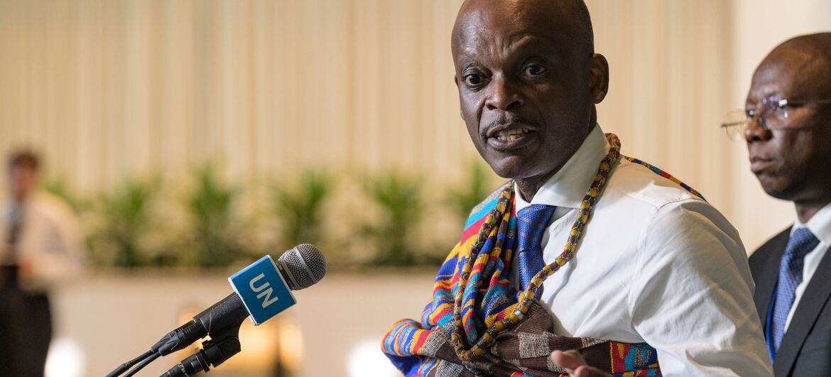
The case for change, as its champions frame it, is about far more than geometry. “Maps guide education, nourish the imagination, and influence collective perceptions,” said Robert Dussey, the foreign minister of Togo, which drove the resolution. “The resolution adopted today reaffirms African reality.” His argument rests on a simple but powerful premise: that how we picture the world shapes how we value its parts, and that generations raised on an image of a small Africa and a towering Europe have absorbed, without knowing it, a subtle hierarchy of importance. A child who sees their continent shrunk on every classroom wall learns something about their place in the world, and it is not the truth. To correct the map, in this view, is to perform what one European official called “an act of truth.”
That official was French. France co-sponsored the resolution and announced on Friday that it would abandon the Mercator projection outright. Its foreign minister, Jean-Noel Barrot, was blunt about what the old map did: on it, he said, “the United States, Russia and China take on a disproportionate visual prominence compared to Africa, Latin America or Southeast Asia,” while “Greenland appears almost as big as Africa.” He added a careful caveat that captures the modest honesty of the whole enterprise: “Changing maps obviously doesn’t change the world. But correcting a distorted representation is already an act of truth.” No one is claiming that resizing continents on paper will redistribute power or wealth. The claim is smaller and harder to dismiss: that accuracy is worth having for its own sake, and that a false picture, once recognized, ought to be fixed.
The projection now being encouraged is called Equal Earth, launched in 2018 by three cartographers, Bojan Savric, Tom Patterson and Bernhard Jenny. Its design goal was precisely the one Mercator sacrificed: it preserves the relative surface areas of the continents while keeping their shapes as close as possible to how they appear on a globe. It is not the first equal-area map, but it is a modern, visually balanced one, and its adoption by the UN gives it a status no map projection has held in generations.
The one loud objection came from the United States, and its reasoning was not cartographic but institutional. The American representative, Yaryna Ferencevych, dismissed the entire exercise before the vote, calling it “the reason this institution is losing its credibility” and complaining that “instead of focusing on genuine problems, this body is debating map projects from the 16th century.” It is an argument worth stating fairly: the UN has weightier crises on its agenda, and a non-binding resolution about map projections can be made to sound like a body fiddling while the world burns. Yet the objection sits awkwardly beside the fact that 164 other nations, including major Western powers like France, judged the matter worth their vote, and that the resolution cost nothing and took little to pass. Sometimes a small correction is just a small correction, not a distraction from large ones.
Whether the world’s maps actually change now rests not on the UN but on the countless institutions that make them: the education ministries, textbook publishers, atlas makers and technology companies whose default settings shape what billions of people see. The resolution binds none of them. It bans nothing, imposes nothing, and the familiar Mercator will not vanish from screens overnight. What has changed is subtler and perhaps more durable. An overwhelming majority of the world’s governments have declared, formally and together, that the old picture was wrong, and named a better one. Maps have always been arguments about the world as much as descriptions of it. This month, the world argued, and it voted, by 164 to one, for a truer sense of its own proportions.
By I. Constantin